Humana
Knowledge Exchange
A networking application for healthcare professionals, writers, and students
Working with Humana was a memorable experience. The agency I represented at the time put my work forward on the RFP. Our selection resulted in me leading this project from a simple marketing site to a full blown application. I was involved the whole way—scoping, documenting, designing, and data architecture.
Beginning an application
Whenever an application hits my workload I like to begin with an exercise called Object Oriented User Experience. It's a great exercise to involve the whole team in—Project Managers, Designers, and Engineers. It enables the team to communicate deliberately with each other, helps define the scope of the project (useful for quoting and setting expectations), and heavily informs the wireframing/prototyping step. Plus it's fun to play with Post-It notes.
We heavily involved Humana at this stage in order to capture their goals for the project. Afterwards, we had a mock-data structure that the development team could run with to begin their architecture, and that the design team could use to start blocking out the UI.
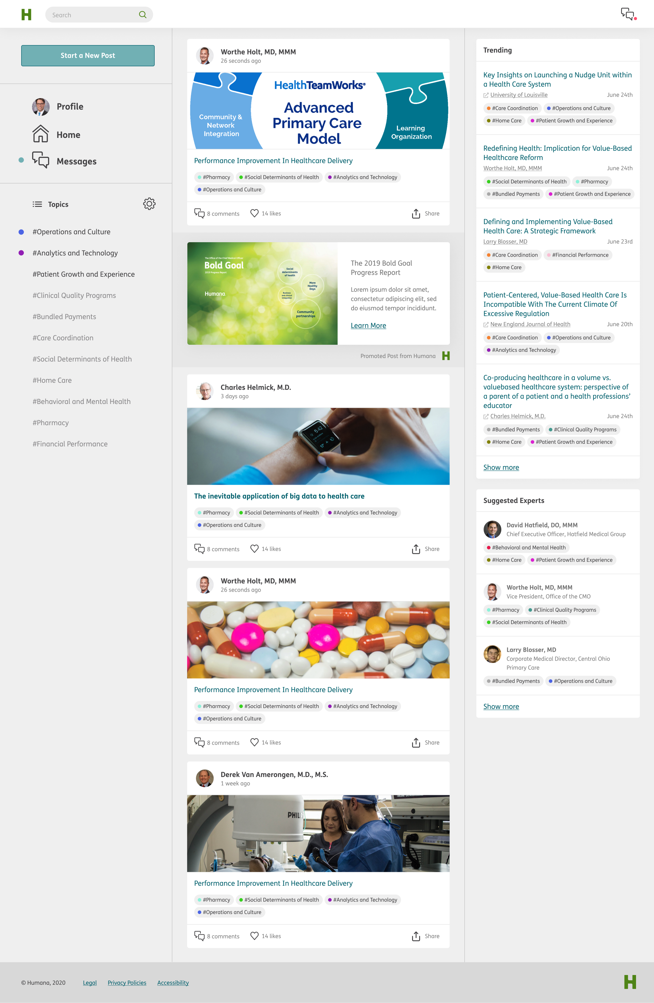
We were aiming somewhere in the middle of the professional networking aspect of LinkedIn and the topic aggregation of Twitter, but with a bent towards academia and medical research.

Key features
Professional networking
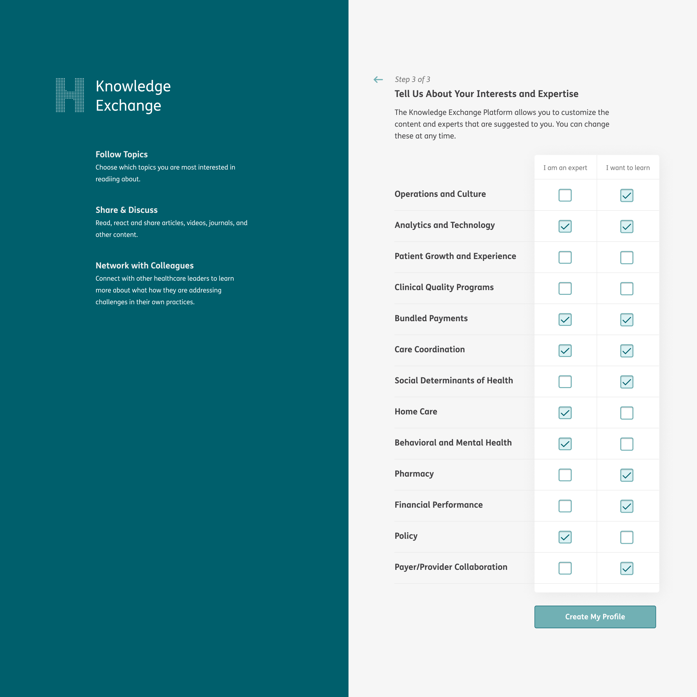
During signup, users self-select areas that they considered themselves experts in, and also areas which they wished to learn more. It was fairly rudimentary, but this would become a powerful piece of data the platform used to populate the suggested experts component.
Academic research & collaboration
The platform was designed with invite-only membership. Researchers could post articles they've written, and because the user-base was limited, Humana would be able to manually curate the topics and content. This would ensure correct taxonomy and reliable information.
Current news & articles
Posts did not always have to be sourced by the author; we also designed the platform to host external posts as well. In that case, we could facilitate the discussion about the post on our platform.
Competitor analysis
I spent a lot of time analyzing (and shamelessly copying) successful products in this space: LinkedIn, Twitter, Facebook. Designing an application to be used intuitively means using patterns that are already established. Furthermore, the big social networks have been optimized by teams whose research capabilities far exceeded the resources available to our team. No matter how much practice I put in, I'd never be able to beat the '94 Chicago Bulls in a pickup game.
Common Layout Conventions


LinkedIn style

Facebook style

Twitter style

Knowledge Exchange style
The most influential similarity between all the style swatches: using a neutral background color, paired with a lighter color to distinguish contentful areas. This serves to deliberately group blocks of similar information and controls, while drawing the user's focus to most important parts of the UI.
About topic tags
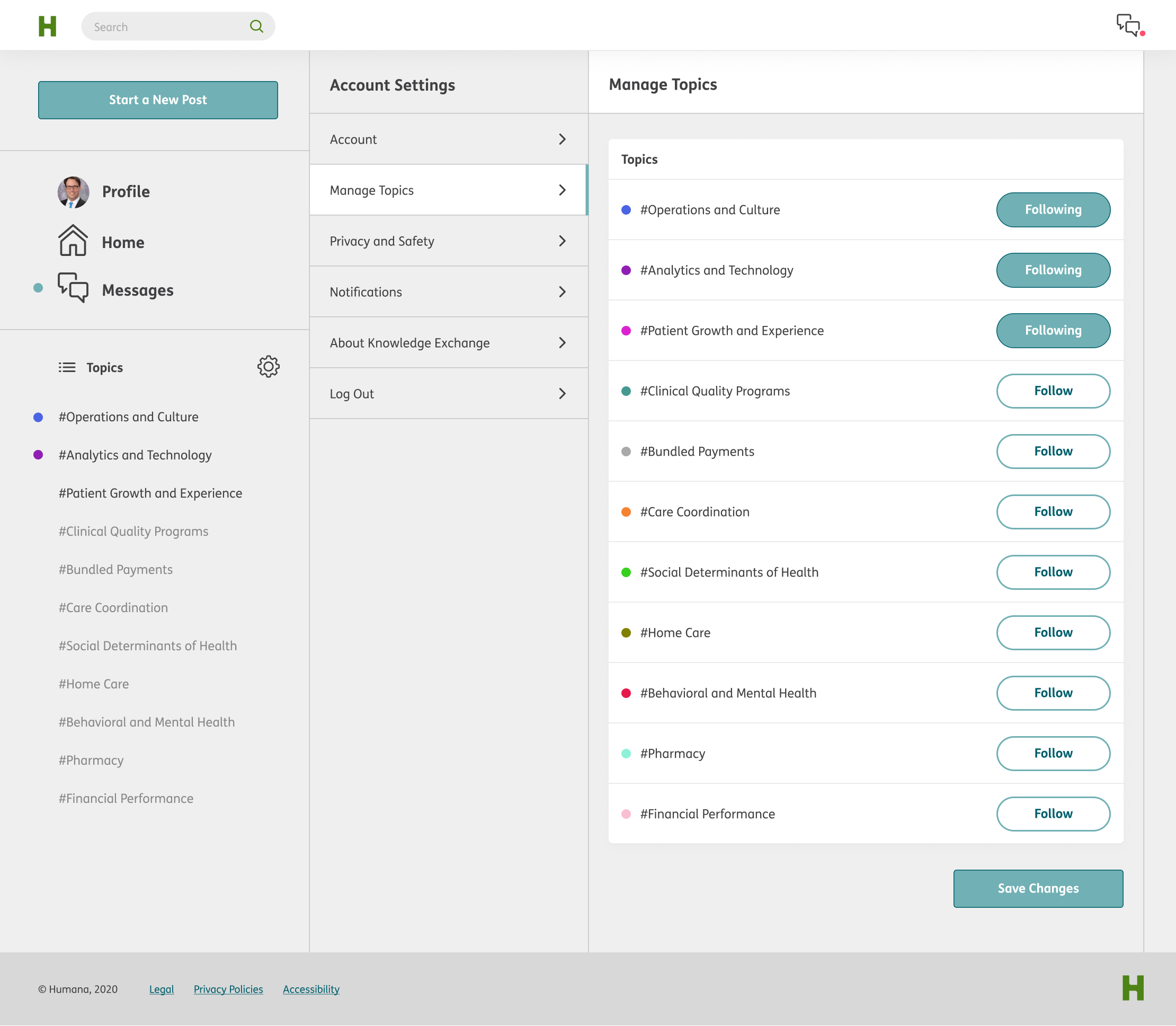
Humana wanted to control the topic system, which gave us an advantage over other topic aggregation systems in that we were dealing with a finite set. We could give each topic a unique color identifier.

Color contrast
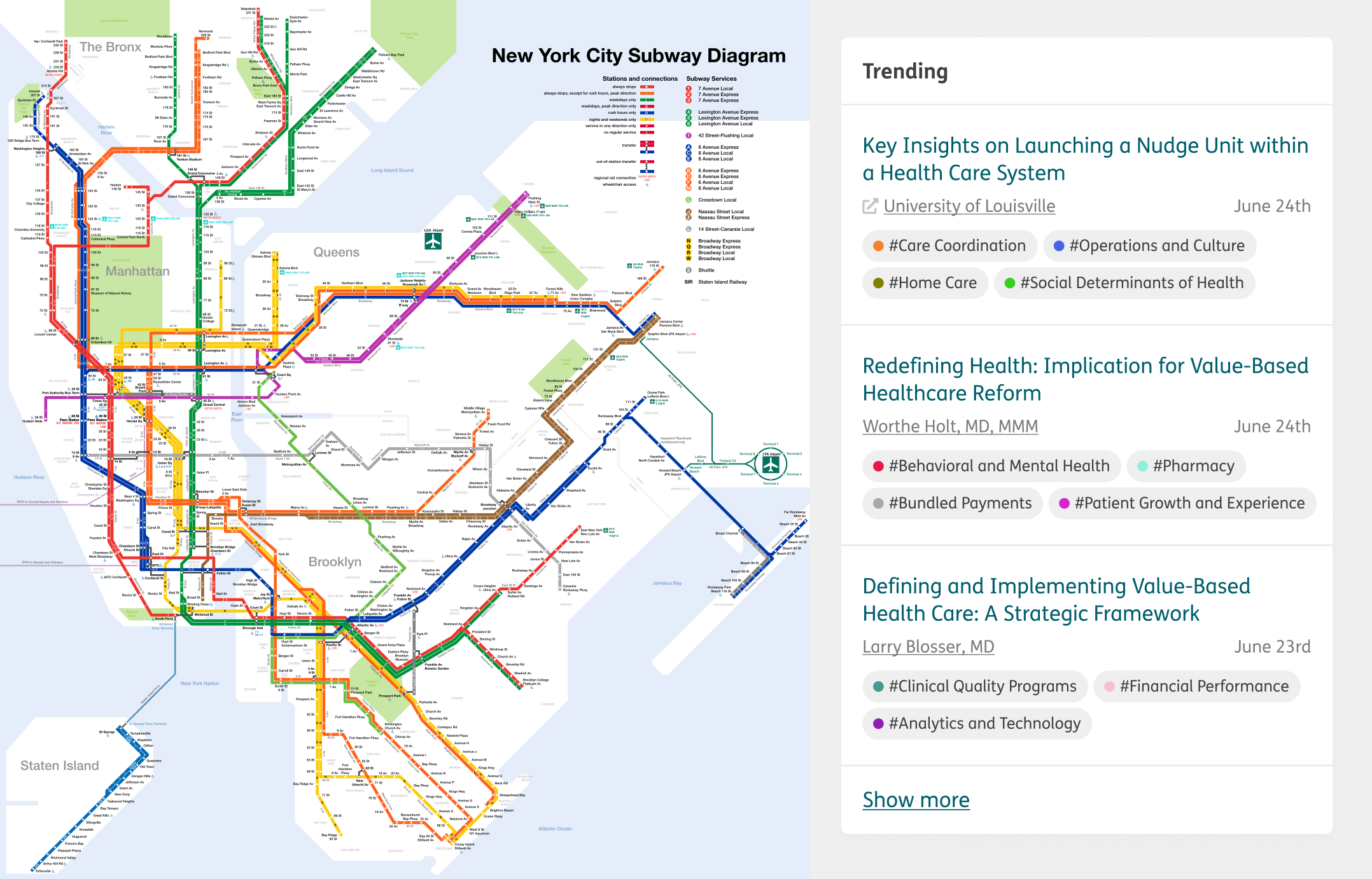
The color indicator was a way to aid scanability of the UI. The challenge here was to find 11 distinct colors that worked with our greyscale. I looked at subway maps for inspiration. Maps are beautiful pieces of information architecture, they need to be quickly parseable and communicate a ton of information.
Mitigating distraction
We opted to indicate the color as a dot. In order for the color to be helpful, and not distracting it had to be a very noticeable color, and filling the background of the tag with this color would draw the users focus away from the main feed.
Hashtag convention
We preserved the hashtag naming convention, as it is widely accepted as a way to indicate a topic—more importantly, interacting with it can retrieve more posts under that topic.


Prototype user research
Humana had access to a physician network willing to participate in user testing of the prototype. Despite largely positive feedback, due to internal company restructuring, this project was no longer a top priority for Humana. The new leadership decided not to undertake a large scale development project. Instead, the function of Knowledge Exchange was left to an existing set of interal tools that were already integrated with their Microsoft enterprise ecosystem.